Friday, 11 April 2014
Final Double Page Spread Edit
I have made a few changes to my double page spread. I have change the font size as before it was to big when I had printed it on to an A3 piece of paper so I have made the font smaller and added more text to fill out the blank spaces on the page.
Thursday, 27 March 2014
Evaluation 1
"In what ways does you media product use, develop or challenge forms and conventions of real media products"
Link:
Evaluation 1 Presentation
Link:
Evaluation 1 Presentation
Evaluation 3
"What kind of media institution might distribute your media product and why?"
Evaluation 3 Presentation
Evaluation 3 Presentation
Evaluation 5
"How did you attract/address your audience?"
I applied a number of techniques to attract and address my
audience, I had to design a page look at the pages and think of things that
would attract my audience so then I started to use original magazines to
inspire me on what I was looking for, and I had to look at it as if I was the
audience to effectively make it better! As my audience is for 15-25 year olds I had to
take into account of what colours complimented other colours to make them stand
out but look professional at the same time.
It’s also aimed mainly at females so to attract girls I had to add more fancy
writing, gossip etc to attract them to buying this magazine. Another way to
attract my audience is the names of big stars mentioned in the contents and
front cover such as Rihanna, Chris Brown, Kim Kardashian etc.
Link Below to see slideshow of my images.
Thursday, 6 March 2014
Evaluation 6
"What have you learnt about technologies from the process of construction this product"
Evaluation 7
"Looking back at your prelim task what do you feel you have learnt in the progression from it to the full product."
Wednesday, 5 March 2014
Re: Audience Feedback
As I have re done my pictures and magazine I had to re do my audience feedback and I have uploaded the images up on to Facebook to get some feedback off my target audience, I will take on board any changes the audience think I should make. By doing this it is helping me to continue on improving my work. I got my feedback it was mostly positive, people have said I need changes here and there so I'm going to make those changes for a better front cover, contents and double page spread.
Tuesday, 4 March 2014
Front Cover
Below is the front cover design I have chosen to be as my cover for my task. I have chosen this cover because it has more on the page than the others, it looks more professional than the others, and has a lot more information. The picture is of Megan looking directly at the audience with a small smile on her face as we didn't want her being to smiley as the genre of my magazine are mainly for R&B genre such as Rihanna, Jennifer Lopez, Beyonce, Rita Ora not the pop genre such as Taylor Swift, Demi Lovarto and One Direction. I have chosen a blue background as it makes Megan and the title stand out more, plus the green and white writing stand out on the blue background. The masthead is bold and a bit of the A is hidden behind Megan's head suggesting that it is a well known magazine.
Monday, 3 March 2014
Thursday, 27 February 2014
Re: Contents page
I have took a screen shot of my contents page. It is the same as my old contents page just instead of an image of Rachel there is an image of Megan.
Wednesday, 26 February 2014
Re: Front Cover Draft
I have created a front cover for one of my tasks I've used one of Billboards front covers as a template to help me set mine out and look professional.
Monday, 24 February 2014
Re: Best Images
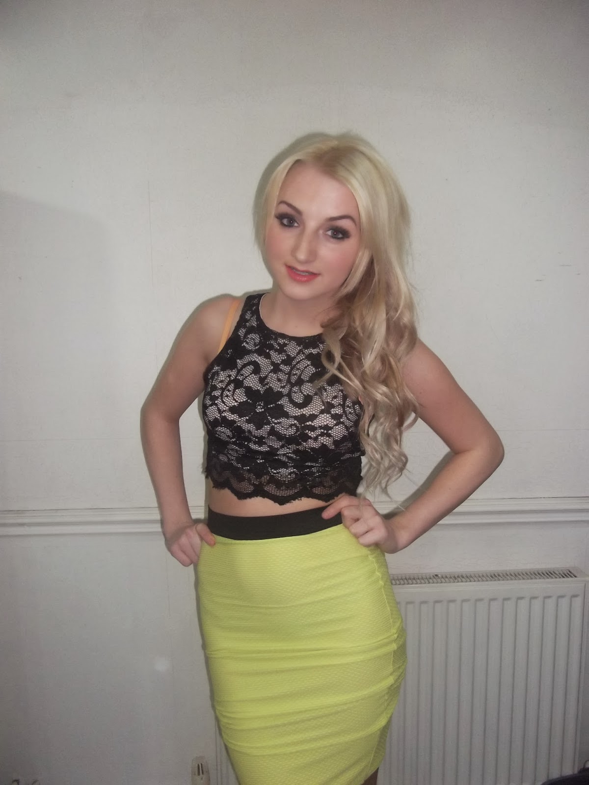
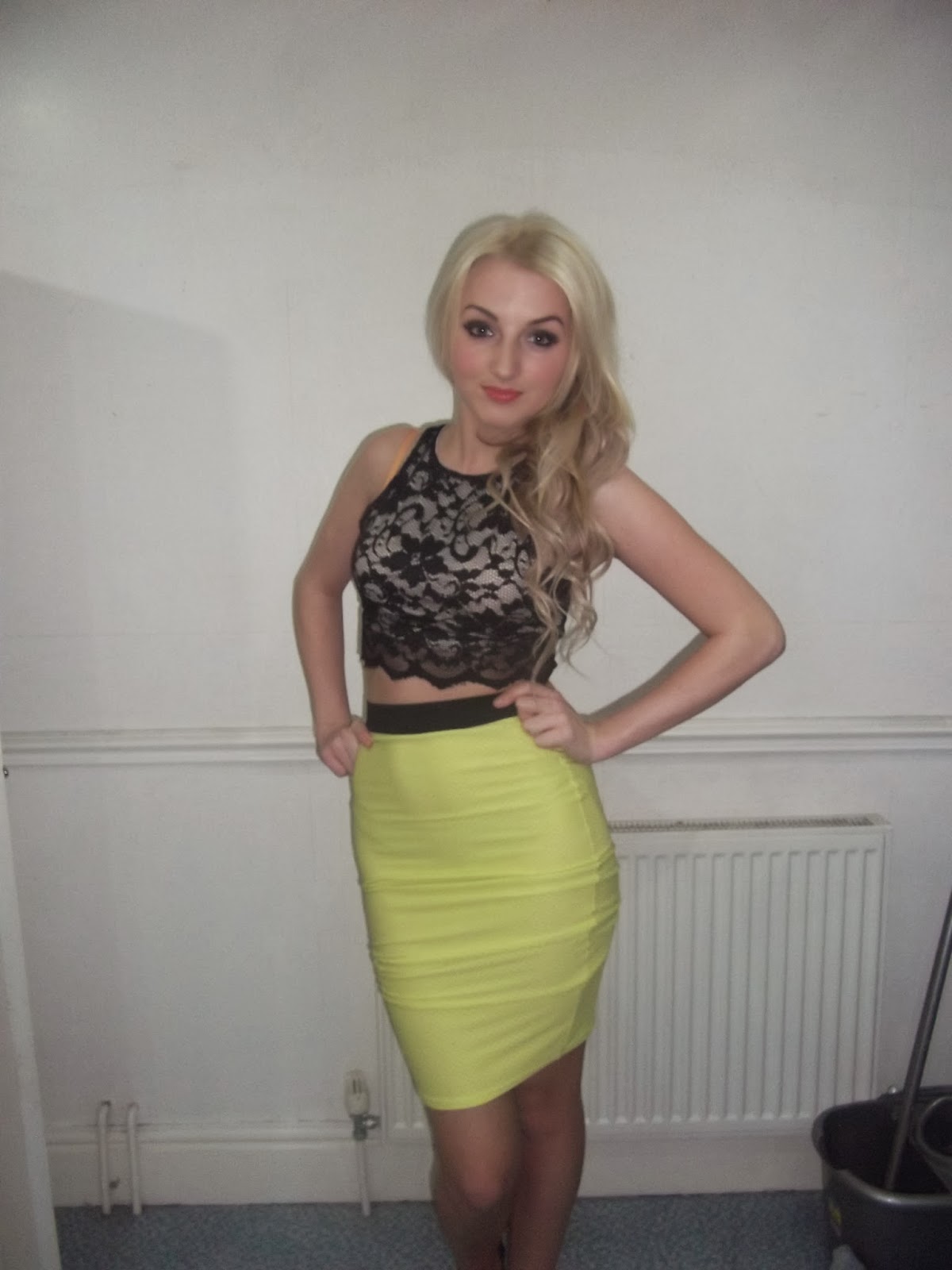
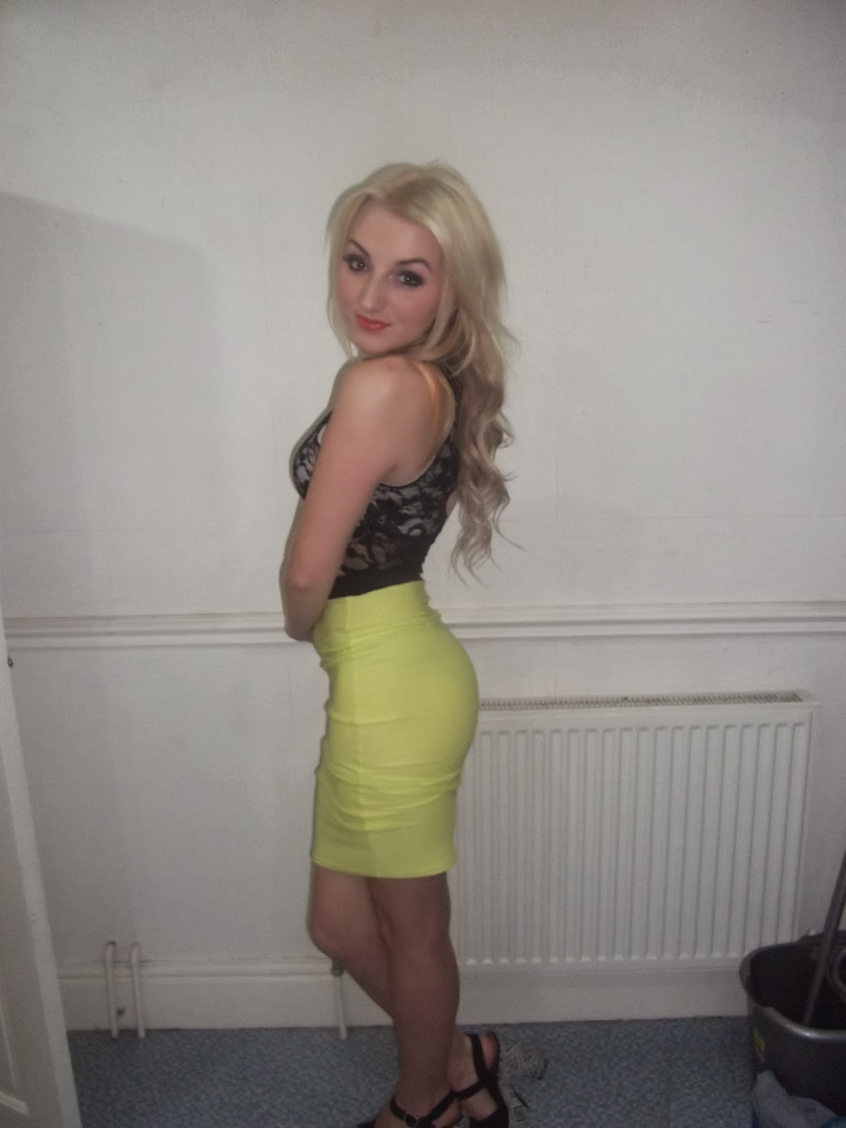
These are the images that Ii like the best out of the lot due to the position Megan is in. It is also appropriate for my target audience and most of these images have direct mode of address making a connection with the reader.
Re: Image Idea's
Below are the poses I had Megan do and the images where I got the idea from to create a similar pose to the original image.
 |
| Selena's image was just plain and simple, it is also an easy image to place in my magazine. ------------------------------------------------------------------------- |
 |
| Demi Lovarto is looking gorgeous in this photo so I re made it by having Megan doing this pose in a similar way but making a few changes. |
Re: Images
I have re taken images for my magazine as I was comparing them with other students work I released that the images weren't as good as I had thought and that they didn't match my audience age target or the genre of my magazine. So in order for me to correct my images I had Megan to come over and re take them with me as Rachel didn't have free time on her hands.
Subscribe to:
Comments (Atom)


